Learning iOS and Swift. Day 22: Generic input field, toolbar
Karol Moroz on
Creating Colors from hex strings
Let’s first start with colors. In the Swift ecosystem, if you wish to use a custom color, you cannot just throw a color string, as you would do on the web, saying salmon, black, or #fa8072. Instead, each custom color must be initialized using floating-point values representing the decimal part of each of the RGB values divided by 255.0. So, for instance:
// #fa8072

0xFA == 250
0x80 == 128
0x72 == 114

// to instantiate a color
Color(red: 250.0 / 255, green: 128.0 / 255, blue: 114.0 / 255)
Being a lazy Web developer, I can’t be bothered to do that much work each time I need a color literal, therefore I wrote a helper to convert strings like #fff or #003366 to Colors. Below is a sample implementation:
import Foundation
import SwiftUI

private let regex = try! NSRegularExpression(pattern: "[^A-Fa-f0-9]")

private func normalizeHex(_ hex: String) -> String? {
  // First, remove irrelevant characters from the string
  let range = NSRange(location: 0, length: hex.count)
  let replaced = regex.stringByReplacingMatches(in: hex, range: range, withTemplate: "")

  // duplicate digits, if needed
  if replaced.count == 3 {
    return replaced.map { char in String(repeating: char, count: 2) }.joined()
  }

  if replaced.count == 6 {
    return replaced
  }

  return nil
}

extension Color {
  init(fromHex hex: String) {
    // normalize the string and parse as hex integer
    guard let normalized = normalizeHex(hex), let int = Int(normalized, radix: 16) else {
      fatalError("Invalid hex string: \(hex)")
    }

    // mask the third byte from the left and move it two bytes to the right
    // then convert it to `Double` and divide by 255.0
    let red = Double((int & 0xFF0000) >> 16) / 255.0
    let green = Double((int & 0xFF00) >> 8) / 255.0
    let blue = Double(int & 0xFF) / 255.0

    self.init(red: red, green: green, blue: blue)
  }
}
As it turns out, I may not be using this helper a whole lot, because all colors in iOS applications need to take dark mode into account, so I might end up setting custom colors through Xcode’s palette.
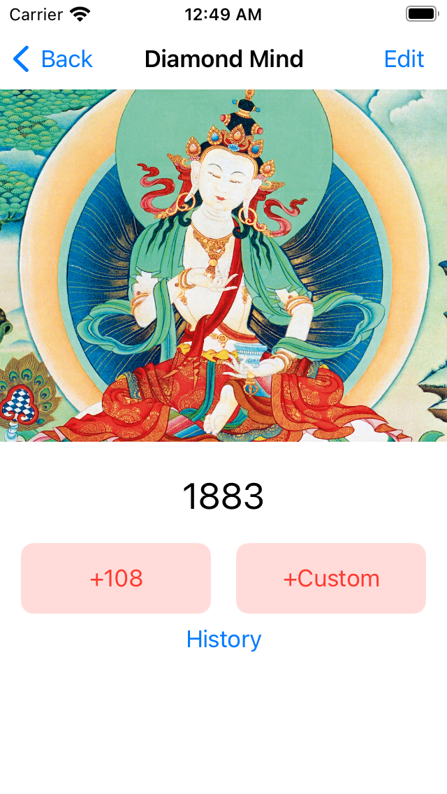
Custom input field with styling
I built a custom text field component with a label and a text field on a greyish background.
I tried to color the background of the input field as Color(fromHex: "#f3f4f5"), only to realize that it was unusable in dark mode.
I ended up picking a gray color from the Color - specifications page of Apple’s Human Interface Guidelines.
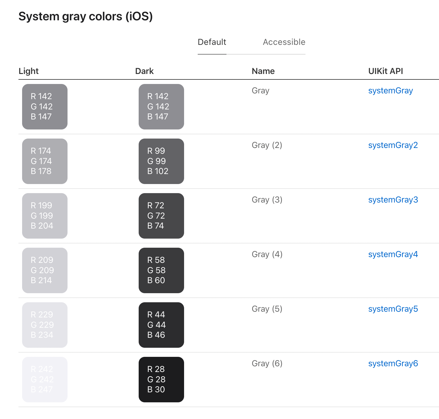
These colors are not part of SwiftUI’s standard palette (such as Color.red), but are exposed in the format of UIColor.systemGray5, so in order to convert the color to the desired type, I had to call it as Color(UIColor.systemGray5).
Another major issue I have encountered while working on this component was that the binding I was passing was of type Binding<String>, but many of the values that I needed to edit were actually Ints, so I had to rewrite the component as a generic.
Below is the implementation:
import SwiftUI

struct AppTextFieldStyle: TextFieldStyle {
  func _body(configuration: TextField<_Label>) -> some View {
    configuration
      .padding(10)
      .background(Color(UIColor.systemGray5))
      .cornerRadius(5.0)
  }
}

struct LabeledTextField<V>: View {
  var label: String
  @Binding var value: V
  var placeholder: String = ""

  var body: some View {
    VStack {
      VStack(alignment: .leading) {
        Text(label)
          .font(.headline)
          .padding(.bottom, -1)
        switch $value {
        case is Binding<Int>:
          TextField(placeholder, value: $value, formatter: NumberFormatter())
            .keyboardType(.numberPad)
            .textFieldStyle(AppTextFieldStyle())
        default:
          TextField(placeholder, text: $value as! Binding<String>)
            .textFieldStyle(AppTextFieldStyle())
        }
      }
      .padding(.horizontal, 15)
    }
    .padding(.bottom, 10)
  }
}
Using this component, I built an edit view, looking like this:
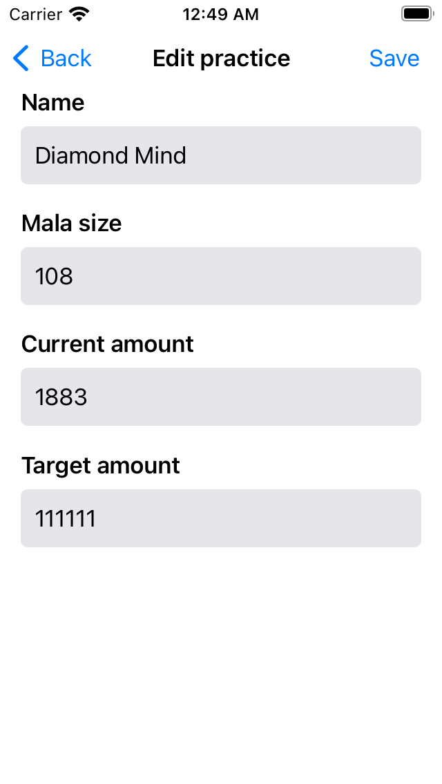
import SwiftUI

struct EditPractice: View {
  var practice: Practice
  @State var draft: Practice

  init(practice pr: Practice) {
    practice = pr
    draft = practice
  }

  var body: some View {
    ScrollView(.vertical) {
      VStack(alignment: .leading) {
        LabeledTextField(label: "Name", value: $draft.name)
        LabeledTextField(label: "Mala size", value: $draft.malaSize)
        LabeledTextField(label: "Current amount", value: $draft.currentAmount)
        LabeledTextField(label: "Target amount", value: $draft.targetAmount)
      }
    }
    .navigationTitle("Edit practice")
    .toolbar {
      Button("Save") {}
    }
  }
}
I also found out that inside a NavigationView, while the left side of the screen is always the back button, the right side of the screen can host a button, and that this part of the view is called “toolbar.”
Back in the practice view, I added a link pointing to the edit screen: