Learning iOS and Swift. Day 9: Neovim configuration, ExerciseView
Karol Moroz on
Syncing Xcode keyboard settings between devices
Xcode stores customized keybindings at ~/Library/Developer/Xcode/UserData/KeyBindings/Default.idekeybindings.
I moved this file to my dotfiles repository and put a symlink to the version-controlled file in its place.
This way I can synchronize my keyboard settings between machines.
Autoformatting and autocompletion for Swift files in Neovim
I come from an Elixir and React background. Both ecosystems come with very good code formatting tools, and I expect my IDE to format my source code each time I save a file. There are as many as three formatters for Swift, none of them easily integrated with Xcode. I kind of gave up on text editing in Xcode and set up formatting in Neovim instead. My formatter of choice is SwiftFormat. You can install it using Homebrew:
brew install swiftformatIn your init.vim, add two settings:
set autoread
autocmd FileType swift autocmd BufWritePost *.swift :silent exec "!swiftformat %"
IntelliSense for Swift in Neovim
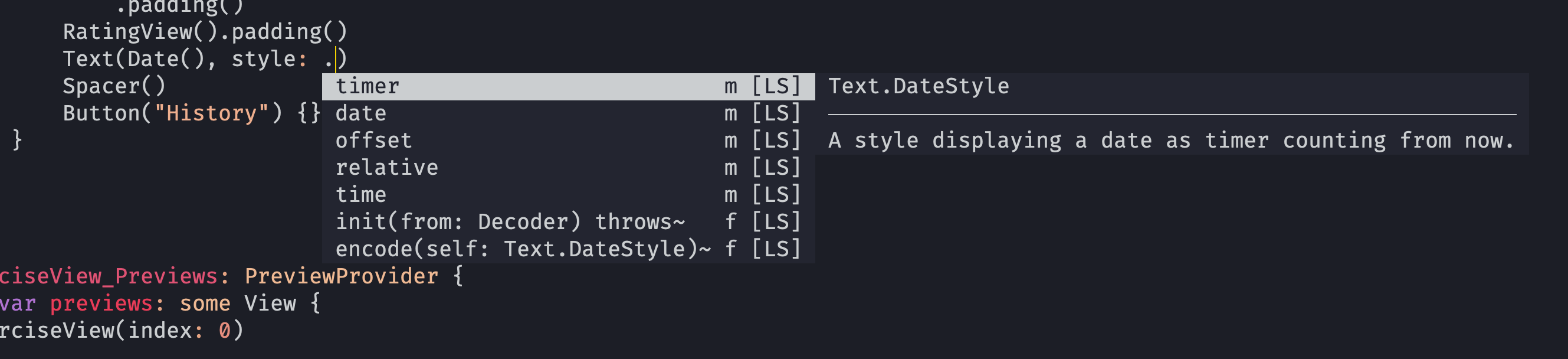
As it turns out, with coc-sourcekit configured correctly, you can get exactly the same IntelliSense as you would normally get in Xcode, albeit with a slight delay. I assume the delay is due to the fact that CoC is built in Node and has some Neovim RPC overhead while Xcode uses optimized binaries. I was initially under the impression that the language server only worked with open source Swift libraries like Foundation, but apparently it also works for SwiftUI just fine.
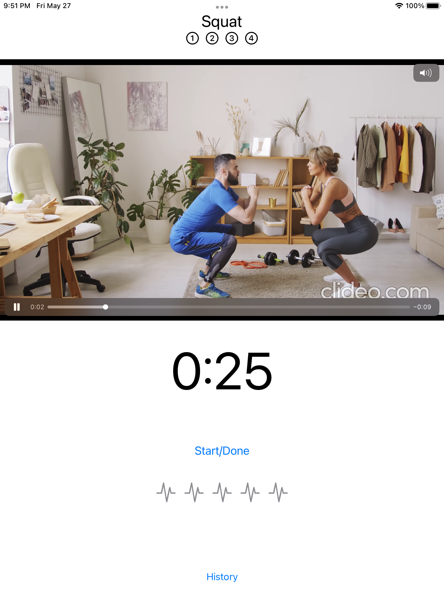
Exercise view
Following chapter 3 of SwiftUI Apprentice, I built a prototype of a view displaying an exercise video, a timer, and some buttons. The book instructed to build the view with preview device set to iPad Pro (9.7-inch). For some reason, the layout I ended up with is different from the one shown in the book. There is more padding under the timer, which breaks the layout on smaller screens. This is the view as of the end of the chapter:
Below is the source code of this view (slightly formatted to fit this blog post):
import AVKit
import SwiftUI

struct ExerciseView: View {
    let videoNames = ["squat", "step-up", "burpee", "sun-salute"]
    let exerciseNames = ["Squat", "Step Up", "Burpee", "Sun Salute"]

    let index: Int
    let interval: TimeInterval = 30

    var body: some View {
        GeometryReader { geometry in
            VStack {
                HeaderView(exerciseName: exerciseNames[index])
                    .padding(.bottom)
                if let url =
                    Bundle.main.url(forResource: videoNames[index],
                                    withExtension: "mp4")
                {
                    VideoPlayer(player: AVPlayer(url: url))
                        .frame(height: geometry.size.height * 0.45)
                } else {
                    Text("Could not find \(videoNames[index]).mp4")
                        .foregroundColor(.red)
                }
                Text(Date().addingTimeInterval(interval), style: .timer)
                    .font(.system(size: 90))
                Button("Start/Done") {}
                    .font(.title3)
                    .padding()
                RatingView().padding()
                Spacer()
                Button("History") {}.padding(.bottom)
            }
        }
    }
}
The scene is wrapped in a GeometryReader view that exposes the screen’s dimensions as geometry, the argument of the closure it takes.
Inside, all children are wrapped in a VStack view, which is kind of like a vertical flexbox.
There is a VideoPlayer component, brough into scope with import AVKit.
If you have an iOS device, you have probably used this component many times, not realizing what it was—it is the default video player component with controls, like the one in iOS Safari.
The URLs for videos are obtained using Bundle.main.url(forResource:withExtension:), which returns an optional URL?.
The function provides URLs for resources embedded locally in the project’s bundle.
If a URL cannot be found, an error message in red is displayed in its place.
The Text component can be used with Dates, and knows how to handle them in many different styles.
In this example, it is used as a countdown .timer.
There is a Spacer component, which basically just flex-grows itself, like a \vfill in LaTeX.
When building components, a good practice is to build them without any outside padding, so that they can be used in different settings.
Padding can then be added to any View using the .padding() modifier.
Another useful feature of SwiftUI is Image, providing access to an insane collection of icons bundled with the system font SF Pro.
It seems that many icons in iOS and macOS 11+ are implemented using these icons, including the green battery symbol with a Harry Potter scar.
You can learn more about these icons at the website of SF Symbols.

Thank you for your attention. I will see you in the next post. Please share your thoughts using the form below.