Learning iOS and Swift. Day 8: Starting off a SwiftUI app
Karol Moroz on
Useful keyboard shortcuts in Xcode
⌥⌘P — resume preview of a SwiftUI scene
There is a keyboard shortcut similar to ⌘P that opens up a fuzzy file finder. By default, this dialog is assigned to ⇧⌘O, while ⌘P is assigned to Print. I remapped the file finder to ⌘P and removed the Print binding altogether (who needs a print dialog in an IDE, anyway???).
Closures
It turns out that you can omit parentheses when passing a closure to a function or method.
Moreover, if a closure consists of only a single expression, the value of this expression will be implicitly returned, so the return keyword can be omitted.
If you do not name the parameters of this closure, they will be made accessible in the body of the closure as $0, $1, etc.
So a map can be written like this:
let collection = ["Hello", "World"]
let uppercasedCollection = collection.map { $0.uppercased() }
print(uppercasedCollection)
// ["HELLO", "WORLD"]
With named parameters, the head of the closure, matching on the parameters, is followed by the confusingly named keyword in:
let dict = [
    "name": "SwiftUI",
    "author": "Apple Inc.",
    "ide": "Xcode"
]

let mappedDict = dict.map { (key, val) in "\(key): \(val)" }
print(mappedDict)
// ["name: SwiftUI", "ide: Xcode", "author: Apple Inc."]
Apparently, closures like this are heavily used in SwiftUI.
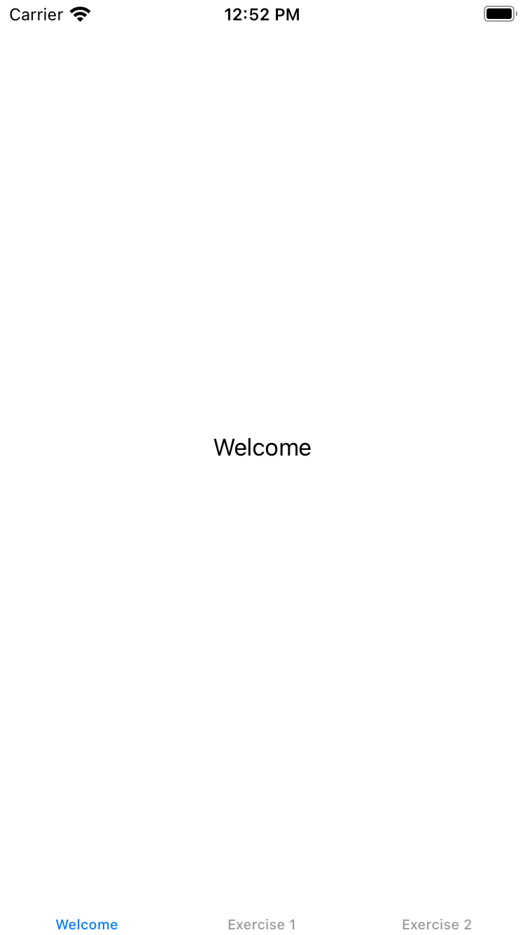
TabView — the tool to build endless tutorial screens
TabView is a component used to build a simple tab navigation.
Each child view becomes a separate tab, and you can set a label on each subview using the tabItem(_ label:) method.
TabView {
    Text("Welcome").tabItem { Text("Welcome") }
    Text("Exercise 1").tabItem { Text("Exercise 1") }
    Text("Exercise 2").tabItem { Text("Exercise 2") }
}
This markup, when compiled, displays the following view with barely legible tabs at the bottom:
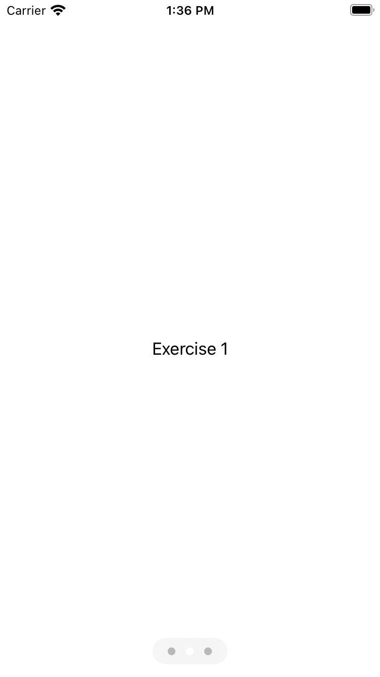
The TabView can be configured to hide the labels and display dots instead, not unlike many tutorials you may have seen in popular applications. In order to do this, we can add .tabViewStyle and .indexViewStyle modifiers, like so:
TabView {
        WelcomeView()
        ExerciseView(index: 0)
        ExerciseView(index: 1)
    }
        .tabViewStyle(PageTabViewStyle())
        .indexViewStyle(PageIndexViewStyle(backgroundDisplayMode: .always))
This way, tab labels can be removed.
PageTabViewStyle and backgroundDisplayMode: .alwaysLater on, the app will display several screens presenting videos of different exercises. For these views, the tutorial instructs to define a component like this:
import SwiftUI

struct ExerciseView: View {
    let videoNames = ["squat", "step-up", "burpee", "sun-salute"]
    let exerciseNames = ["Squat", "Step Up", "Burpee", "Sun Salute"]

    let index: Int

    var body: some View {
        Text(exerciseNames[index])
    }
}
As you can see, the component API is dead simple. A minimal component would be comprised of a struct with View protocol, defining a calculated property body.
Thanks to SwiftUI’s protocol magic, the statement let index: Int, defining a property without a default value, is automatically converted to a required prop.
I tried to find a way to also pass optional props to components.
I annotated a property with an optional type.
This way, the property cannot be omitted when rendering the component, but it can be nil, which is easy enough.
In order to conditionally display a component (akin to {condition ? <Component /> : null} in React), it suffices to wrap the content in an if statement.
let anotherProp: String?

var body: some View {
    VStack {
        Text(exerciseNames[index])
        if let text = anotherProp {
            Text(text)
        }
    }
}
Note the use of a VStack view. This is a wrapper that puts components one on top of the other, just like a flexbox with flex-direction: column;.
There is also a HStack, which, unsurprisingly, behaves kind of like a flexbox with flex-direction: row;.
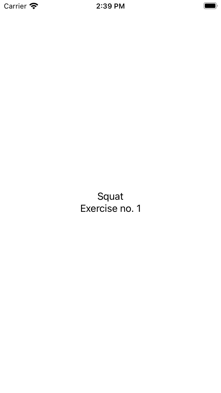
Finally, in the main view of the application, we iterate over a range:
struct ContentView: View {
    var body: some View {
        TabView {
            WelcomeView()
            ForEach(0 ..< 4) {
                ExerciseView(index: $0, anotherProp: "Exercise no. \($0 + 1)")
            }
        }
        .tabViewStyle(PageTabViewStyle(indexDisplayMode: .never))
    }
}
The dots on the bottom of the screen are now hidden, leaving the end user clueless with regard to navigation.
This is done by removing .indexViewStyle and passing indexDisplayMode: .never to PageTabViewStyle in .tabViewStyle.
The ForEach component is SwiftUI’s way of iterating over the elements of a collection or range, but I’m guessing there is also some sort of a list component, as these are usually more performant than iterations on mobile OSes.
At this point, the application looks like this:
That’s all for today, and I will see you tomorrow.